Backgrounds & heroes
The best animated websites: 20 examples and why they work
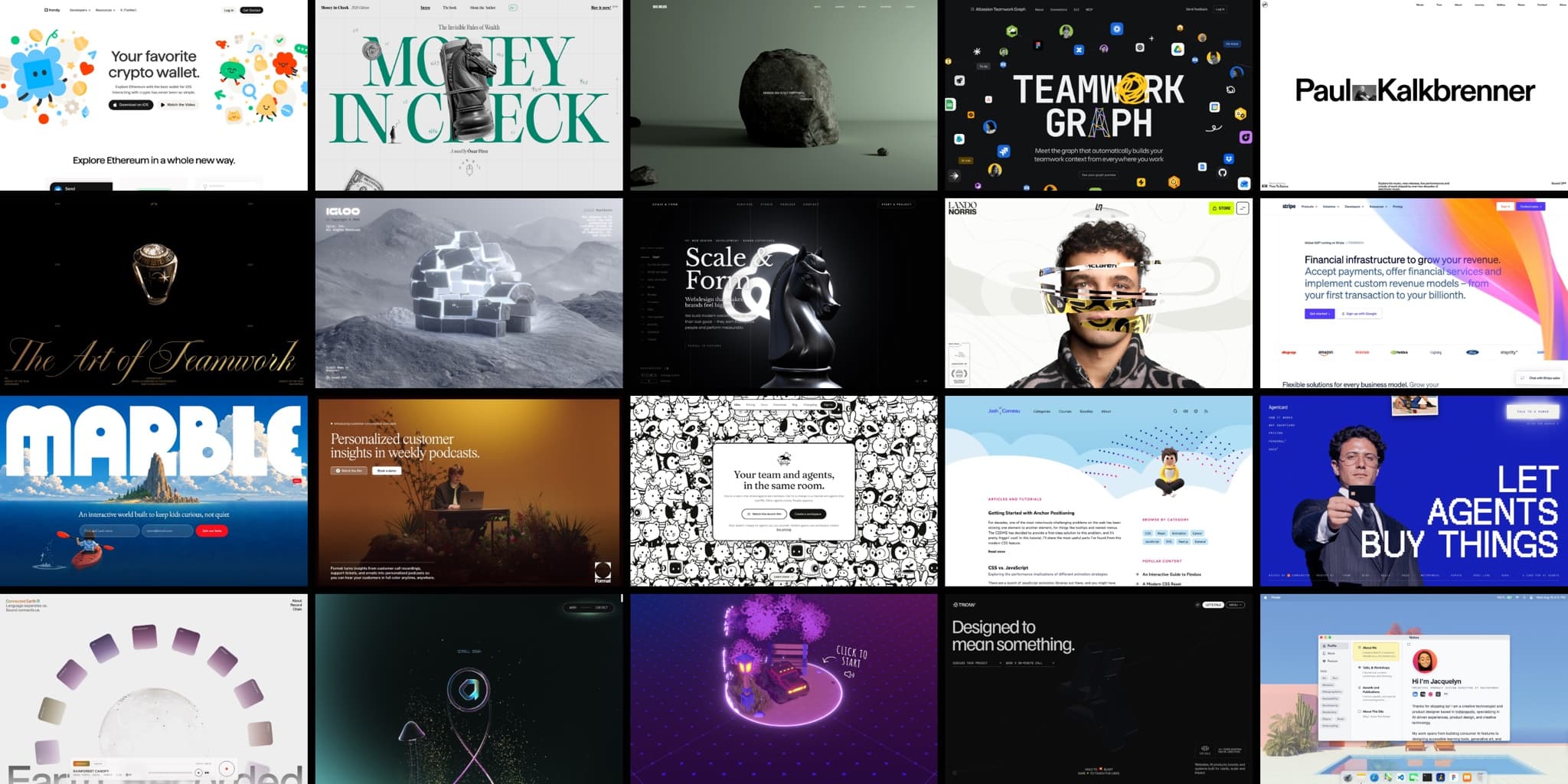
What separates great website animation from decoration?
The twenty animated website examples on this page are grouped by what their motion is doing: opening the page, telling a story as you scroll, holding the background, giving feedback to your actions, or carrying the whole site by itself. Ten get a critical breakdown; the other ten are honourable mentions. Every one is graded for effort.
The first question to ask
There’s a habit worth breaking before you scroll any further: seeing a site you admire and asking, first, how did they do that? It’s the wrong first question. Nearly every animated website on this page is made from the same short list of ingredients, and knowing which library produced it won’t help you.
The better first question is: what is the motion doing? On the good sites there’s always an answer. The motion opens the page, or walks you through a complex idea, or holds an atmosphere, or reacts to your inputs, or is the entire point. On the weak sites, it’s there because a static page felt underdressed.
So that’s how this list is organised: not by industry or effect name, but by the job the motion is doing. Five sections, each with a test you can apply to any site you meet, including your own:
Motion that opens the page
It has already happened before you touch anything.
Motion that tells the story
Scrolling is what drives it. Stop scrolling and it stops.
Motion that holds the background
It runs whether you’re there or not, and never asks for attention.
Motion that reacts to you
It’s a reply to your interaction with the site.
Motion that is the site
You couldn’t describe the site without describing the motion.
How we graded these animated website examples
Every entry also carries an effort grade (Copy-paste, A weekend, or Agency-scale), because the thing lists like this never tell you is that many of the sites everyone admires took a team the better part of a year. Sitting a six-month studio build next to something one person shipped in a weekend, with no way to tell which is which, is how readers get discouraged before they start. The grade is a budget signal, not a technical one, and it’s a judgement from experience: we’ve built this kind of thing, not just looked at it.
One last thing about how the list was made. Wherever we could, we sat with the site live, watched what it does, and counted. Where a number appears in an entry, it was measured. Where we couldn’t check something, the entry says so instead of guessing.
The 20 best animated websites at a glance
| Site | What the motion does | Entry | Effort |
|---|---|---|---|
| Family | Opens the page | Full | A weekend |
| Money in Check | Opens the page | Full | Agency-scale |
| Max Milkin | Opens the page | Mention | A weekend |
| Teamwork Graph | Opens the page | Mention | A weekend |
| Paul Kalkbrenner | Opens the page | Mention | A weekend to Agency-scale |
| Locomotive Dynasty | Tells the story | Full | Agency-scale |
| Igloo Inc | Tells the story | Full | Agency-scale |
| Scale & Form | Tells the story | Mention | Agency-scale |
| Lando Norris | Tells the story | Mention | Agency-scale |
| Stripe | Holds the background | Full | Copy-paste |
| Marble | Holds the background | Full | Copy-paste to a weekend |
| Format | Holds the background | Mention | Copy-paste |
| Hilos | Holds the background | Mention | A weekend |
| Josh Comeau | Reacts to you | Full | A weekend |
| Agent Card | Reacts to you | Full | A weekend |
| Connected Earth | Reacts to you | Mention | A weekend |
| Active Theory | Is the site | Full | Agency-scale |
| Bruno Simon | Is the site | Full | Agency-scale |
| Trionn | Is the site | Mention | Agency-scale |
| Jacquelyn Yakira | Is the site | Mention | A weekend |
Swipe the table to see Entry and Effort →
Motion that opens the page
A site belongs in this section if the motion has already happened before you touch anything. No scrolling, no clicking: the page arrives rather than appears.
It’s also the most transferable kind of website animation, because every site has an entrance whether anyone designed it or not. Yours has one right now. Are you using those first seconds to make an impression?
Family
Visit the site — Family
What you notice first. A crowd of little vector illustrations rises in from the bottom of the screen, and once they’ve arrived they don’t stop. They keep drifting and bobbing. The style is graphic, almost cartoon-like, and it doesn’t go off duty after the hero: the page runs more than eleven thousand pixels deep, and the illustrated world holds the whole way down, with product screens playing as quiet recordings inside it.
Why it works. Family makes a crypto wallet, an app that asks you to trust it with money, and the tone does the arguing. Crypto sites reach for moody; Family opens with something closer to an illustrated storybook: playful, graphic, hand-drawn. A company relaxed enough to be charming about money reads as one with nothing to hide.
And the fact to take away: there is no animation library on this site. We counted 67 animations running live, every one plain CSS, with nine screen recordings carrying the product-demo work. One of the most charming sites on this list is built from the two most ordinary materials on the web.
Steal this: stay in motion after it lands. Elements that keep gently drifting once they’ve arrived make a page feel alive instead of loaded.
Effort: A weekend.
Money in Check
Visit the site — Money in Check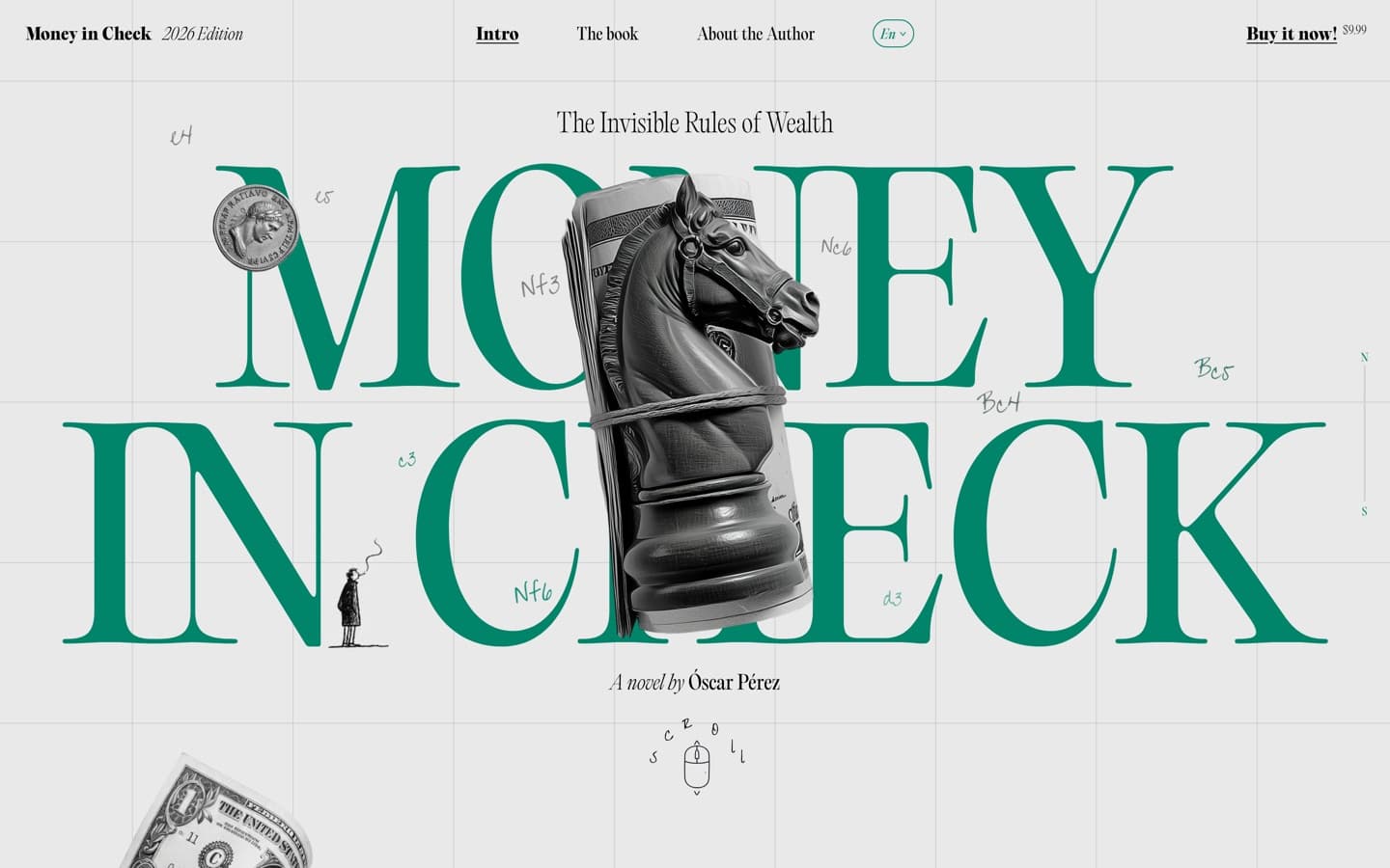
What you notice first. A book cover, set out for you before you arrive. The title stands in tall green serif type on ledger paper, with a chess knight wrapped in a rolled dollar bill at its centre and the moves of a real chess game (e4, e5, Nf3) pencilled across the grid like margin notes. Even the scroll prompt is a hand-drawn doodle of a mouse, and the dateline knows what day it is.
Why it works. It’s the website for a novel, and the opening screen works like a dust jacket: the premise, that money is a game with invisible rules, is told in objects before you’ve read a sentence. Nothing on the screen is generic.
Steal this: set the scene before the first scroll. One strong metaphor, told in objects rather than adjectives.
Effort: Agency-scale. The craft is as much art direction as code.
Worth your time
- Max Milkin
The load screen is the entrance, a slow spiral of letters orbiting the loading counter and resolving into the words of his trade.
A weekend.
- Teamwork Graph
Atlassian’s compact pitch, with 43 animations doing the explaining and not one video among them.
A weekend.
- Paul Kalkbrenner
This is the Vanta favourite. Why? Because the photo of Paul sitting in a classic car tells you everything you need to know about him. Great intro animation.
A weekend to Agency-scale.
Motion that tells the story
A site belongs here if scrolling is what drives it. Stop scrolling and the story stops. People call this scrollytelling: as you scroll, a visual story emerges. The two full entries below are the strongest scrollytelling examples on the list.
Locomotive Dynasty
Visit the site — Locomotive Dynasty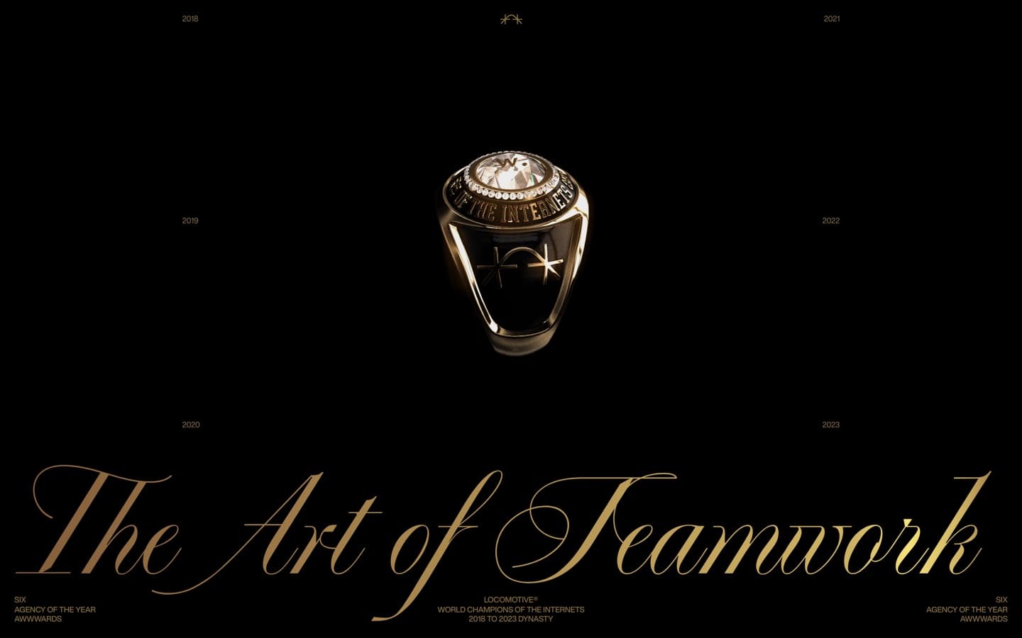
What you notice first. Gold on black, and a scoreboard. Locomotive Dynasty is the studio’s anniversary site, and it tells 2018 to 2023 the way a sports film would: year by year as you scroll, in champagne-gold serif type, all grit-meets-finesse language and championship swagger.
Why it works. The swagger is earned line by line. Scroll on and the record appears season by season: 235 awards across six years, laid out like league standings. The format is a victory lap, so the content had better be a winning record, and it is.
Steal this: if your story has years, chapters or seasons in it, let the scroll turn the pages.
How they did it: this is the studio that wrote locomotive-scroll, the scrolling library half the industry borrowed.
Effort: Agency-scale.
Igloo Inc
Visit the site — Igloo Inc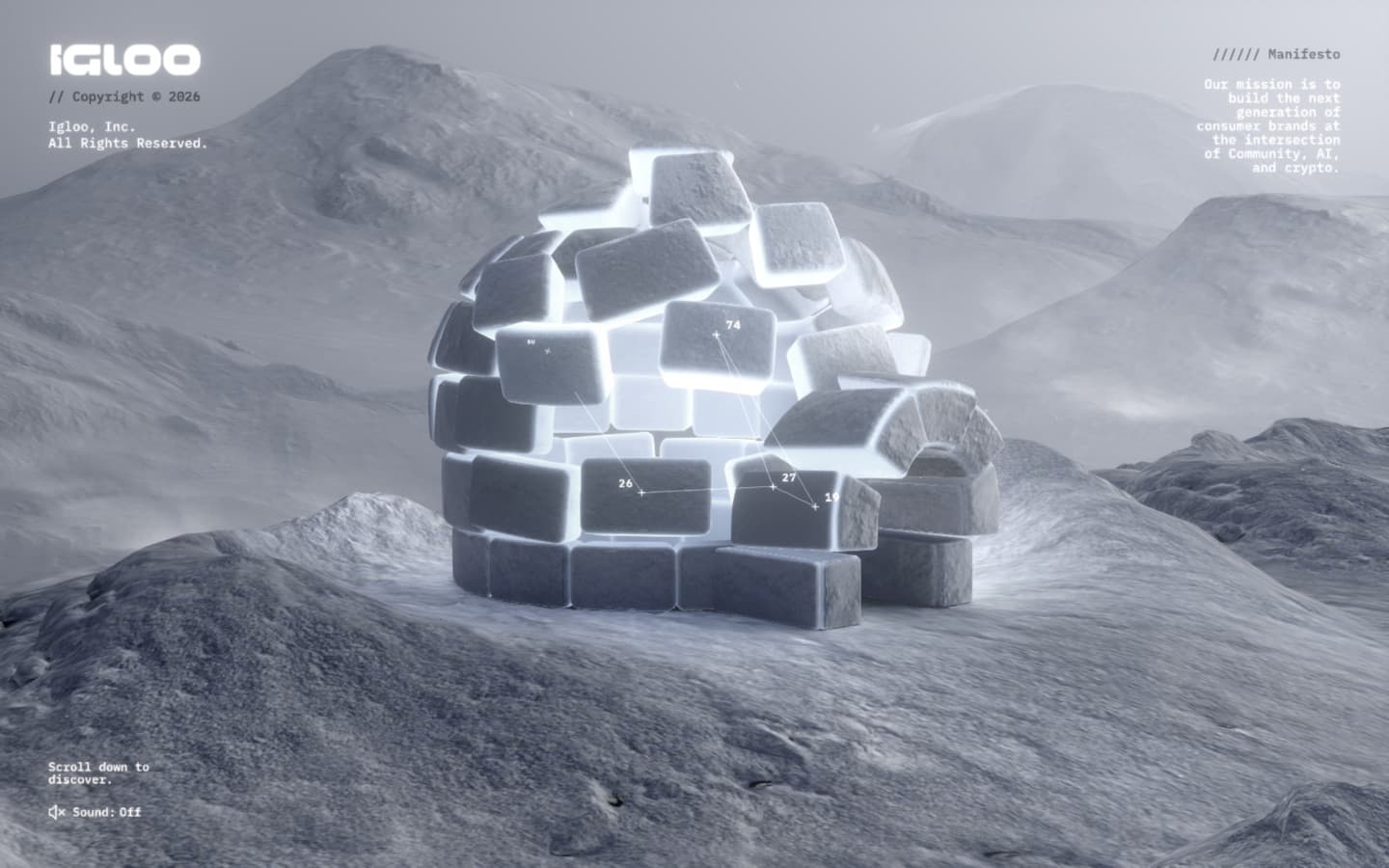
What you notice first. That there’s no page under it. By the builders’ own account, the entire interface is drawn in WebGL: a crystalline world you move through by scrolling, with the interface living inside the scene rather than sitting on top of it.
Why it works. Total commitment. It’s a 3D experience that transports you to another world. There are stop-off points for content, but mostly you just enjoy the scroll, which, if you keep going, loops all the way around.
Steal this: for when the story is a journey, or you want to impress with seriously good 3D.
Effort: Agency-scale. You need serious talent for this one.
Worth your time
- Scale & Form
A black chess knight the size of the viewport, and whole scenes that swap around it as you scroll.
Agency-scale.
- Lando Norris
A portrait that gives way to a season told in marquee type; the scroll does the storytelling.
Agency-scale.
Motion that holds the background
A site belongs here if the motion runs whether you’re there or not. It doesn’t demand attention, but it sets the scene for what to expect. (This is the category our animated backgrounds article takes apart technique by technique, with working demos.)
Stripe
Visit the site — Stripe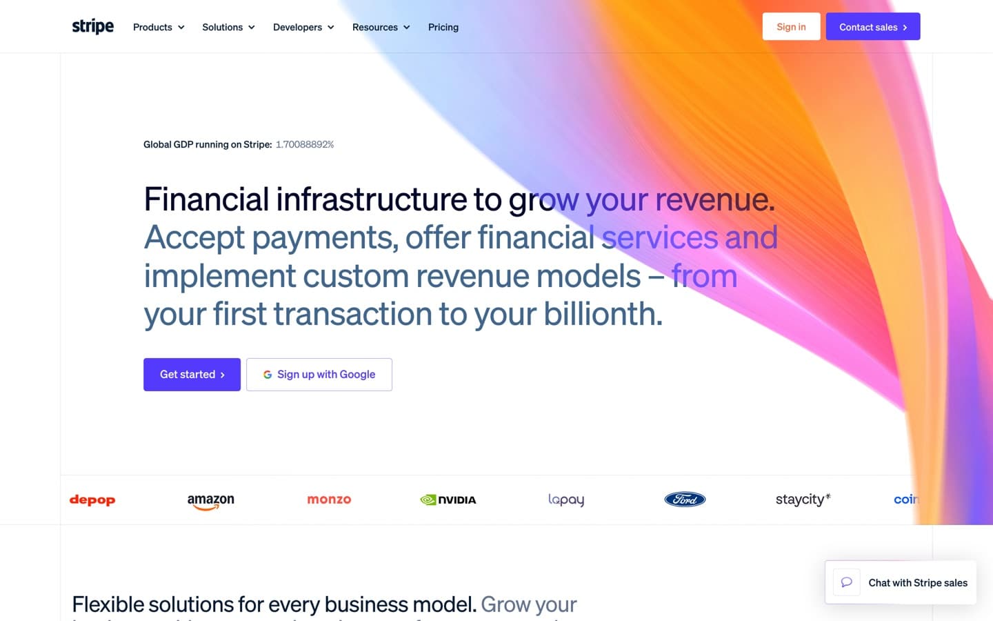
What you notice first. The colours. Stripe’s ribbon of drifting colour sits behind the hero, moving slowly enough that you’d struggle to say what changed, and it still reads as theirs from across the room.
Why it works. Stripe has reached the point where it doesn’t need to shout. No elaborate animation, no elite 3D. The hero even carries a live ticker announcing how much of global GDP runs on Stripe. Companies at that scale often tone the design back, and Stripe has settled on a small wave of colour as the brand. Animating it subtly keeps the page feeling alive without ever pulling attention from the product.
Steal this: a holding background should move too slowly to draw much attention. It’s hinted at, not watched or played with. Let the product do the talking, and use the motion to reinforce your brand.
How they did it: hand-built WebGL, a drawn field of colour rather than a video.
Effort: Copy-paste, the one top-tier effect you can honestly lift. Our Lab’s drifting colour mesh is the same species of effect, prompt included (see the last section).
Marble
Visit the site — Marble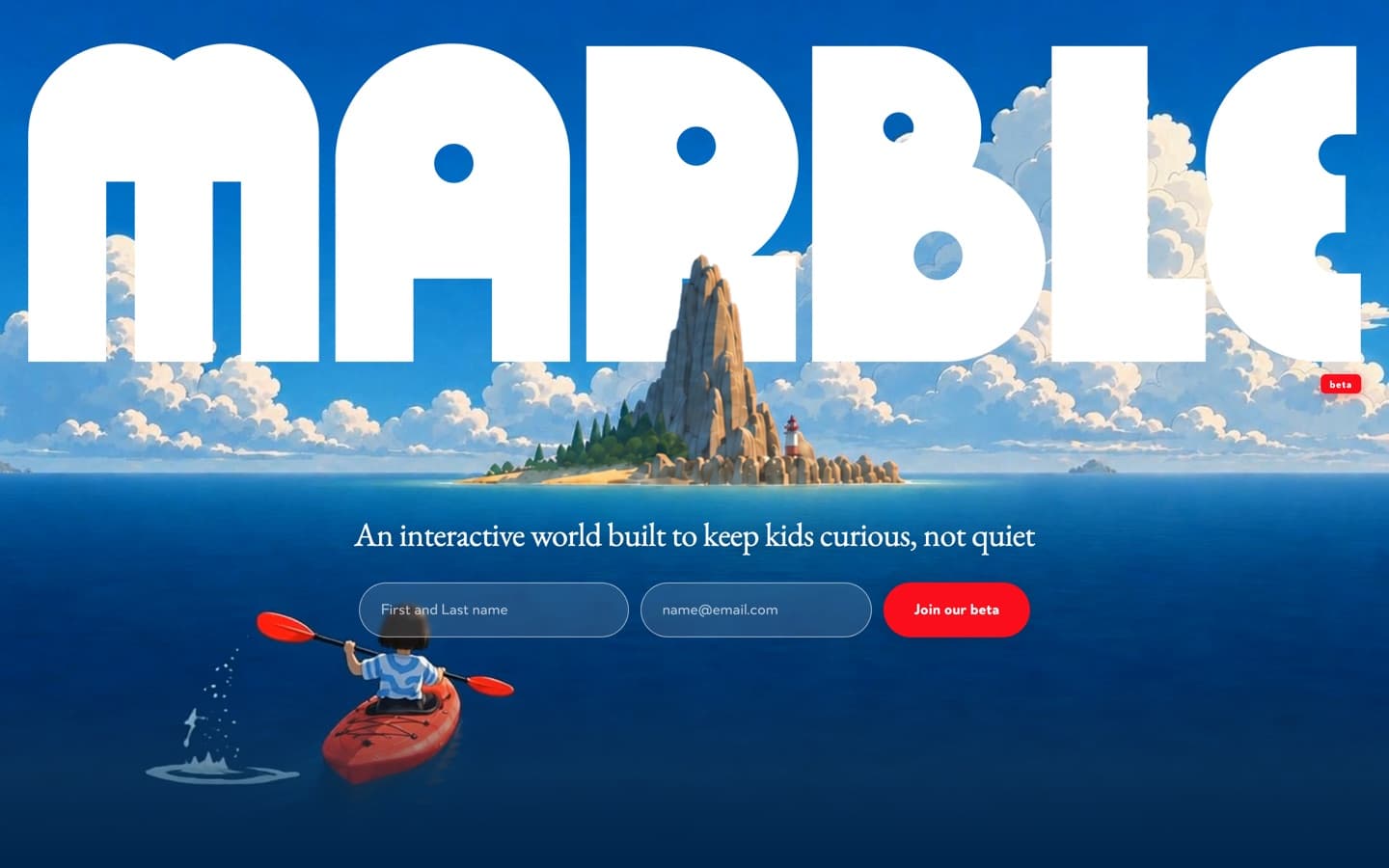
What you notice first. The word MARBLE fills the screen in fat white letters, and rising through the gaps behind it is a tiny modelled island: a mountain, pines, a lighthouse. A diorama on a shelf behind the wordmark, there before you touch anything and never in the way of it.
Why it works. The background is the promise. Marble is an interactive world for kids, and the one piece of world on the page sits quietly behind the brand; you understand the product before you’ve read a word. Then the page has the sense to stop: below the hero it turns editorial (cream paper, serif type, a red thread stitching the sections together) and lets the first screen carry all the atmosphere.
Steal this: one modelled thing behind your wordmark beats motion sprinkled everywhere.
Effort: Copy-paste to a weekend. You could get most of the way there with AI image and video generation.
Worth your time
Motion that reacts to you
A site belongs here if the motion is a reply. You moved, pressed, dragged or typed, and the interface answered. It’s rarely anything full-screen, just micro-interactions: little moments of delight.
Technically, anyone using AI tools can build these. Being imaginative enough to produce an interaction that makes someone smile is the tricky bit.
Josh Comeau
Visit the site — Josh Comeau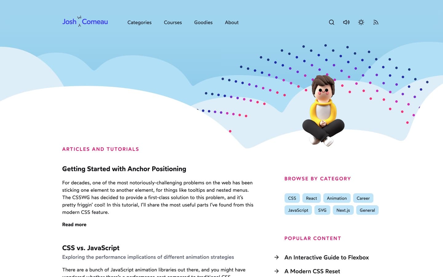
What you notice first. The page seems pleased you’re there. Move through it and things answer (tilt, spring, light up), always in proportion, never for long. Go and explore the little details, like what happens when you scroll to the bottom.
Why it works. The interactions are the teaching. He writes about interface feel for a living, and the site makes the case by being it: every reply is quick, soft and slightly over-generous, so curiosity keeps getting rewarded. Better yet: no animation library. All of it hand-built from CSS and SVG, the same materials as every plain site you’ve ever shipped.
Steal this: one interaction that brings delight is worth ten you’ve seen on every other site.
Effort: A weekend.
Agent Card
Visit the site — Agent Card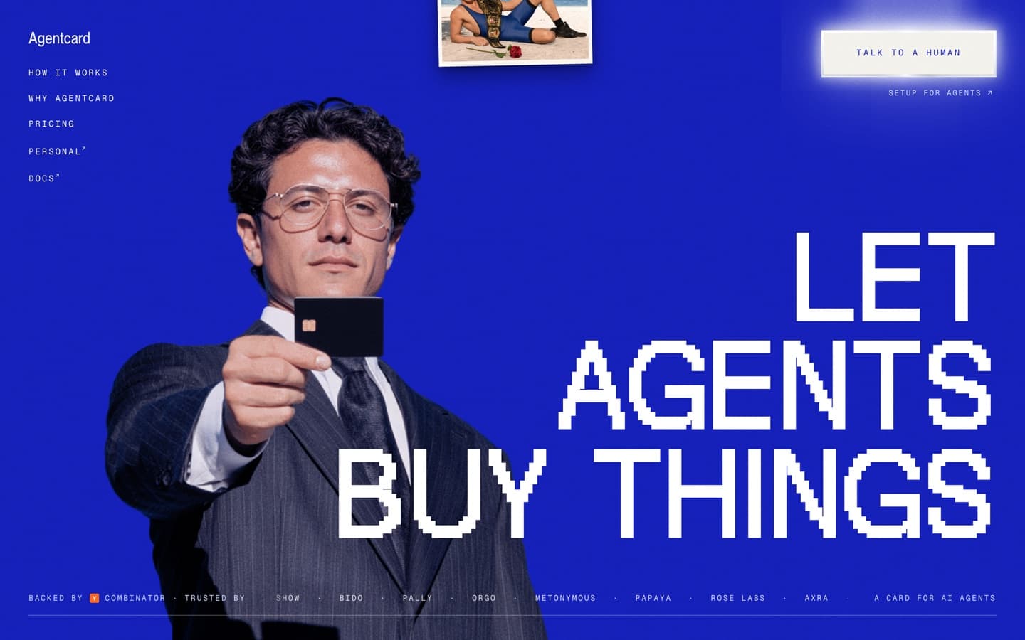
What you notice first. The man is looking at you. The hero is a corporate photograph (suit, glasses, a black card held out toward you), and wherever you move the cursor, his eyes go with it. Glance at the nav and he glances with you. One photograph, behaving like a person.
Why it works. The one trick carries the whole pitch. Agentcard’s product is a card an AI agent can spend on your behalf, something minding your interests while you look elsewhere, and the site’s main flourish is an interface that watches you back. Elsewhere you’ll find little hover animations on the buttons, all tongue-in-cheek, bringing a bit of comedy to your browsing. You leave remembering the man who followed your cursor, which is to say you leave remembering what they sell.
Steal this: make one element acknowledge the visitor. Amusing touches are what make a site memorable enough to share.
Effort: A weekend. The trick is small, and the photography can be generated these days (GPT Image or Nano Banana will get you the shots); making it look this good takes some tweaking.
Worth your time
- Connected Earth
A particle globe and a radio of field recordings from around the planet; press play and the Earth answers.
A weekend.
Motion that is the site
A site belongs here if you couldn’t describe it without describing the motion. Take the motion away and there’s nothing left: no page underneath, no copy doing the work. The spectacle tier, and the least reachable one. These double as the most extreme interactive website examples on the page; they’re here to stretch your sense of what a browser will do.
Active Theory
Visit the site — Active Theory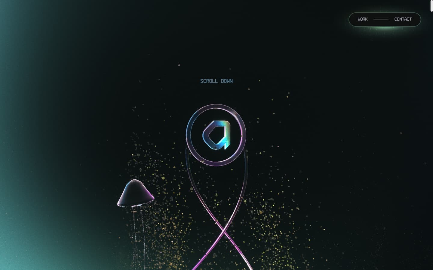
What you notice first. The 3D world you’re dropped into. As you scroll you dive deeper underwater, rotating around a spinal column while a tornado of portfolio work passes you. It takes the traditional website navigation experience and kicks it across the park.
Why it works. Active Theory builds interactive worlds for other brands; a homepage of paragraphs would argue against itself. The motion isn’t illustrating the pitch. It is the pitch, delivered in the only medium that could make it.
Steal this: count the words your front page actually needs; the number is smaller than you think. Sometimes you have to show people, not tell them.
Effort: Agency-scale.
Bruno Simon
Visit the site — Bruno Simon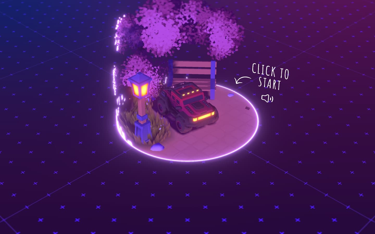
What you notice first. A toy truck. Bruno Simon’s animated portfolio website is a drivable world: you steer a little truck around his work, knocking things over on the way.
Why it works. Joy, mostly, but disciplined joy. Driving is a slower way to read a CV, and that’s the point: nobody remembers a CV, and everyone who’s been here remembers the truck. It’s the web’s best argument that a personal site can be a place rather than a document.
Steal this: if your site is personal, it’s allowed to be a toy. Memorability compounds.
Effort: Agency-scale: one person, but one who does this professionally.
Worth your time
- Trionn
A studio showreel of a site that saves its big drawn set-piece for the very last screen, five thousand pixels in.
Agency-scale.
- Jacquelyn Yakira
Her portfolio is a macOS desktop, with menu bar, Dock, and her CV in a Notes window over a pastel poolside. The conceit is the site.
A weekend.
What is the key to elegant animations?
Look back down the list and the pattern is hard to unsee: on every site that works, the motion has a purpose. Family’s storybook entrance argues a crypto company can be warm. Stripe’s drifting field shows visual intrigue while staying completely neutral (enterprise brand styling). Bruno Simon and Josh Comeau remind you the internet can be fun. Take the motion off any of these and the site says less.
That’s also how motion fails. If the page would say just as much standing still, the animation is decoration, and it’s adding to the page load for no reason.
So elegance isn’t a property of the easing curve. It’s the fit between the motion and the point. One idea, committed to completely, tuned until it belongs to the brand: that’s what every site above has, and what no template gives you. It’s also the difference between the best animated website and a merely busy one.
How do I get animations like these on my own site?
Most of the website animation effects you admire are cheaper than they look, so start in the tier you can reach today. The reacts-to-you moves (entrances, hover replies, button feel) are CSS and a well-worded prompt away, and two of the most admired sites in this article are made of exactly that.
For the ambient tier, the Lab is where we keep our working demos, each with the prompt that built it: a drifting colour mesh in the same family as Stripe’s, a dark-glows effect in pure CSS, an event-horizon centrepiece, and a real three.js scene if you want an object rather than a field. Paste the prompt into Claude Code or your agent of choice, then spend your time on the part that matters: tuning the result until it’s yours.
If the motion you want is filmic (real light, refraction, grain no shader fakes), the Materials packs are loops and stills made for exactly this. Drop one behind your hero, set it to autoplay muted, and the hardest-looking effect on your page becomes the easiest one to ship.
The longer version of all of this, every approach compared with numbers, is our animated web backgrounds article.
Frequently asked questions
How do I find out how a site did something I like?
Two minutes in the browser gets you most answers. Right-click the thing and choose Inspect to see what it's made of; the Network tab lists names you might recognise (GSAP, three.js, Framer Motion, Lenis); a canvas element means drawn graphics rather than regular page parts. And the unfashionable option works best of all: ask. People who build these sites love being asked.
Do I need a developer to get animation like this?
For most of this list, no. Entrances, hover replies and background effects are the kind of work an AI coding agent produces well from a clear prompt, and two of the most admired sites here use no animation library at all. The exceptions are the worlds in the last section: drivable trucks and crystal caverns remain specialist work.
Do website animations slow a site down?
Only if you pay for weight you didn't need. Measured from our own demos: an ambient CSS effect costs 4.4 KB and no JavaScript; a WebGL colour field, 2.9 KB over the wire; a full three.js scene, 182 KB before your scene code; a video loop, megabytes. Slow sites aren't slow because they animate. They're slow because they shipped the 182 KB option to draw what the 4.4 KB option draws.
How long does a site like the ones on this page actually take to build?
The honest range on this list runs from a weekend to the better part of a year. The entrance tier (Family's choreography, a gaze that follows your cursor) is days. Ambient heroes are days to weeks. The worlds are teams-for-months territory, and pretending otherwise is how inspiration lists make people miserable. That's what the effort grades are for.
How much motion is too much?
When two things compete for your attention, both lose. Our working rule is two motion-heavy moments per page, with everything else calm. The test for each survivor: can you say what it's for in one sentence? Stripe passes with thirty animations because twenty-nine of them are small utility. A page can fail with three, if all three are decoration.
What is scrollytelling, and is it worth the effort?
A scroll animation website drives its story with the scrollbar: stop scrolling and it stops. Worth it when your content has a real order, like a product journey, a season, or a descent. Not worth it for pages people came to skim; nobody wants their reading speed choreographed.
Where can I see websites built with Claude Code or other AI tools?
There's no good gallery yet, mostly because the claim is hard to verify: nothing in a finished site proves which tool wrote it. The example we can vouch for is the one you're reading: this site is a Claude Code build, and the Lab publishes the actual prompts. Beyond that, builders' own writeups, rather than showcases, are where the truth lives.