Backgrounds & heroes
Animated backgrounds for websites: 6 approaches compared
What a background actually does
A background is the first thing a visitor feels and the last thing they should notice. Get it right and the page has a mood before anyone reads a word. Get it wrong and it fights your headline, flattens the battery, or looks like every other site built from the same template. Six techniques cover the whole category, and the one that suits you depends on your page far more than on the effect you liked somewhere else. All six are below, running, with the prompt behind each.
How do you make an animated background for a website?
You make an animated background for a website with one of six techniques.
- CSS. Gradients, glows and blurs animated by the browser itself. Works everywhere, and needs no JavaScript.
- WebGL shaders. The GPU runs a small program that colours every pixel at once.
- Canvas 2D. Shapes drawn on the CPU, frame by frame. This is what particle fields and constellation effects are made of.
- Real 3D with three.js. Actual geometry, lighting and cursor response, on top of a heavy library.
- Video. Filmic quality no shader can match, measured in megabytes.
- A still with slow motion. One strong image, moving slowly enough that you never catch it.
Drop-in tools are not a seventh technique. They are a way of getting the middle three without writing them, so they get their own section below.
Here is how the six compare before you write a line of your own.
| Approach | Over the wire | Depends on | Best for |
|---|---|---|---|
| CSS | 1.6 KB gzipped | None | Content-heavy pages that still want atmosphere |
| WebGL shader | 2.9 KB gzipped – 8.4 KB gzipped | None | Hero statements, one per page |
| Canvas 2D | 2.0 KB gzipped, or 10–40 KB with a library | None, or a particle library | Particles, constellations, anything with many small parts |
| Real 3D (three.js) | 182 KB gzipped | three.js | When the background is an object, not a field |
| Video loop | 2–6 MBTYPICAL | None | Organic light and grain code can't fake |
| Static-with-motion | One imageTYPICAL | None | Anywhere you already have a strong image |
| …via a drop-in tool | 100 KB+TYPICAL | The tool's own runtime | Prototypes and deadlines |
Every demo below is ours, built for this article, and each one ships with its prompt.
CSS and WebGL animated backgrounds you can prompt today
The usual question is how to get the kind of animated background the big, polished sites have. The answer is to describe the technique to your coding agent, not the mood you’re after. A prompt that names the method (“domain-warped simplex noise in one WebGL fragment shader”) lands 90% of the way there, where a prompt that says “make it look expensive” lands you a purple rectangle.
Every effect in this article has a live demo, the full prompt, and a verdict on when to use it, plus a standalone page with the measured payload, the pixel-ratio cap and its reduced-motion behaviour written out in full.
The slow colour mesh: a WebGL gradient background
A slow-moving field of blended colour, the style you’ll recognise from big SaaS homepages. One shader, no libraries, seven colours blended by slow-moving noise, with film grain mixed in to stop the gradients banding. A full cycle takes about a minute, so it never fights your headline.
Use it when You want a premium hero without a video file: a field of slow colour that fills the frame and never asks for attention. Skip it if your hero already carries heavy imagery. A mesh behind a busy photo is noise on noise.
Add a full-viewport animated mesh-gradient background to my hero section, the style you see on big SaaS homepages, but on a dark palette.

Requirements:
- One WebGL fragment shader on a <canvas>, no libraries.
- Use 3D simplex noise with domain warping to blend these colours: base #070812, indigo #1B2873, teal #0FA98C, violet #6543CF, magenta #D6408F, plus a restrained warm accent #FF6A2A and a faint cyan #63E2FF that only surface in small drifting patches.
- Motion must be very slow (full drift cycle around 60 seconds), organic, with no visible looping seams.
- Add fine film grain (~3% strength) inside the shader to prevent gradient banding.
- Cap devicePixelRatio at 2 and resize cleanly with the window.
- Respect prefers-reduced-motion: render a single static frame instead of animating.
- Pause the render loop when the tab is hidden.
- If WebGL is unavailable, fall back to a static layered CSS radial-gradient in the same palette.
- Zero dependencies, under 8KB of JavaScript, and don't block first paint.
Liquid chrome: a pure CSS animated background
Six silver shapes moving across a black field, merging into each other and pulling apart again like mercury. No canvas and no shader. This is a stylesheet, and it is the one genuinely surprising thing plain CSS can still do.
Use it when You want the page to feel like a lit material rather than a lit rectangle, and you cannot spend a shader on it. Skip it if the background sits behind dense text. These are solid shapes with hard edges, not a soft wash, and they will compete with anything set over them.
It is two filters. A blur softens every edge, then a heavy contrast pass snaps it hard again. Where two soft shapes overlap they fuse, and pulling them apart makes the join thin out and break. Nobody wrote any physics. It just behaves like surface tension.
One thing to know if you build one: keep the shapes almost grey. The contrast pass exaggerates any colour you give them, and a saturated violet turns the whole thing into a lava lamp.
Build a liquid-metal background as a pure CSS effect. No canvas, no shader, no JavaScript. Silver shapes drifting on black, merging into each other and pulling apart again like mercury.

THE MECHANISM, which is the entire trick

Two filters on one container: blur, then extreme contrast.

Blur spreads each shape's edge into a soft ramp. The contrast pass forces every pixel of that ramp to either full or nothing, so the edge snaps hard again. But where two blurred shapes overlap, their ramps ADD, cross the threshold sooner, and the pair fuses with a smooth neck between them. Move them apart and the neck thins, pinches and breaks.

Nobody writes any physics. That is just what a threshold does to two overlapping gradients, and it looks exactly like surface tension.

    .field {
      position: absolute;
      inset: -8%;
      background: #000;
      filter: blur(18px) contrast(11);
    }
    .blob { position: absolute; border-radius: 50%; }

Six blobs inside .field, each with its own size, start position and keyframe animation.

THE TWO SETTINGS THAT DECIDE HOW IT LOOKS

- CONTRAST sets the surface tension. Low merges lazily and looks gooey; high snaps and looks like metal. 11 is a good starting point.
- BLUR sets the scale of the necks: how far apart two blobs can be and still connect. 18px suits blobs at 10–20% of the frame.

They move together. Raise the blur and you must raise the contrast to keep the edge hard.

KEEP THE SOURCE SHAPES ALMOST GREY

This is the mistake to avoid and it is not obvious. The contrast pass amplifies whatever saturation you give it, clipping each colour channel independently, so a saturated violet blob clips to a flat magenta, a warm one clips to red, and you get a lava lamp instead of chrome. Use near-neutrals with only a few points of tint (#b5aec6, #9c8a84, #d3d0de and similar). Mercury is greyscale; the colour you want comes from the edges, where two different tints meet and clip differently. That fringing is the iridescence, and it is worth more than colouring the blobs ever would be.

Pure black inside the filtered container, too. Anything lighter and the contrast lifts the whole backdrop into a grey haze, and the silhouettes stop reading as solid.

MOTION

Six blobs, all different sizes, all travelling different distances on unequal periods between about 15 and 35 seconds, ease-in-out, alternating. Unequal is the point: matched cycles make the whole field pulse as one, which is the tell that it is six divs. Let them travel a long way, 40–80% of the frame, so pairs genuinely meet and separate rather than jostling in place.

COST AND ACCESSIBILITY

One blur and one contrast pass over the layer, plus six animated transforms. The filter is the expensive part, so keep the blur modest and let the contrast do the work of looking sharper than it is. Never put a filter on each blob, one pass for the whole field.

Under prefers-reduced-motion, pause the animations rather than removing them. The blobs freeze mid-merge, which is a composition rather than a blank screen: the shapes are the effect here, and they survive stillness perfectly well.

Mark the wrapper aria-hidden. It is decoration.
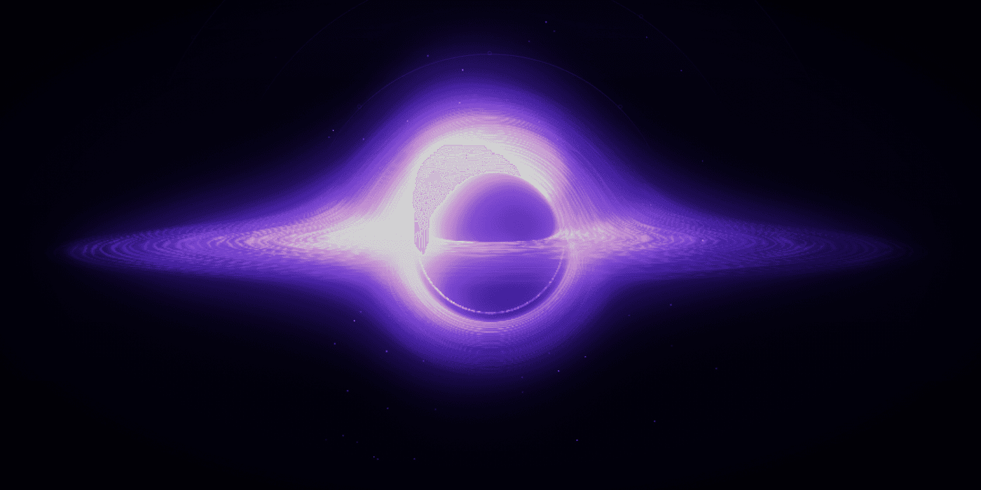
The event horizon
A black-hole centrepiece: a white-hot arc of light doming over a genuinely dark core, a razor-thin horizontal blade of light, and a purple glow spilling down into the page. Unlike the ambient effects above, this one has composition: a subject, a horizon, and a light source in a fixed place. The others are a field that happens to be everywhere at once.
Use it when Your hero carries exactly one message and can afford a centrepiece with real structure. Skip it if your hero contains product UI. The object will fight the screenshot.
# Recreate the Event Horizon glow: paste everything below into a fresh session

This prompt rebuilds the black-hole hero glow from this project exactly: a
real-time, ray-traced, gravitationally-lensed black hole with flowing streaks,
as a single self-contained React component. Every number in it was measured or
hard-won; follow them literally, and treat the **traps** as law. Each one cost
real debugging time.

---

Build me a real-time WebGL black-hole glow as a React client component
`GlowCanvas.tsx` with this exact contract: `<GlowCanvas onReady={fn} />`,
rendering into a `<canvas style="width:100%; aspect-ratio:16/9; display:block">`.
The parent fades the canvas in when `onReady` fires after the first rendered
frame. No libraries: raw WebGL2, two shader passes. No video files, no images:
everything procedural.

## The one method that works

**Simulate the scene; do not paint the picture.** A 2D shader that draws the
parts as separate shapes (ring + arch + bowl + wings summed) WILL fail at page
scale: seams between the parts read as an "eye", and without real bloom it
looks like flat airbrushed art, even if every sampled pixel matches. The arch
above the hole and the bowl below it must EMERGE from light bending, because
they are the far side of one disk seen along curved rays.

### Pass 1: HDR scene (render to a float texture at 0.62× canvas resolution)

Units: Schwarzschild radius = 1. Camera at distance 30, elevated 0.068 rad
(~3.9°) above the disk plane, looking at the hole. Screen mapping: work in
fractions of frame height, hole center at `(0.5, 0.508)`, **note
`gl_FragCoord` is bottom-up; 0.508 from the bottom = 49.2% from the top**.
Focal length: the shadow rim (impact parameter b = 3√3/2 ≈ 2.5981) must land at
radius **R = 0.1019 × frame height**: `sinθ = 2.5981·√(1−1/30)/30`,
`focal = R·cosθ/sinθ` ≈ 1.19.

Per pixel: cast a ray, fast-forward analytically to a sphere of radius 15.5,
then march ≤150 steps with `dt = clamp((r>6 ? 0.11 : 0.06)·r, 0.035, 1.1)`
(fine near the hole, coarse far out where rays are nearly straight), bending the
velocity by the cheap geodesic `a = −1.5·h²·p/r⁵` (h² = |p×v|² computed once at
entry, it is conserved). Capture at r < 1.02 (add interior fog 0.05, the
shadow is violet, never black); escape when r > 15.5 moving outward.

The accretion disk is the equatorial plane, radii 1.15 → 14. Whenever a step
crosses the plane (`prev.y · pos.y < 0`), interpolate the crossing point and
add surface emission:

- Radial profile: `smoothstep(1.15, 1.55, rc) · exp(−max(rc−3.4,0)·0.30) ·
  (1 − smoothstep(12, 14, rc))`, times an inner-edge blaze
  `1 + 3.6·exp(−(rc−1.15)·1.4)`, this blaze is what fuses the white crown.
- Doppler beaming: orbital direction chosen so the LEFT arm approaches;
  `β = max(√(0.5/rc), 0.30)` (the floor keeps the left/right asymmetry visible
  far out, the reference's left arm is ~2× the right), boost = `1/(1−0.68·β·μ)`
  cubed, where μ = orbital velocity · direction-to-camera (use the ray's
  CURRENT direction, it has bent).
- Also accumulate a faint volumetric halo each step hugging the plane
  (`exp(−y²·1.3)`, gain 0.035/unit length) for the wings and dome.

**Empirical shaping, keyed to crossing kinematics, not screen position** (the
reference look demands it, and screen-position gates are unreachable from
inside the shader anyway):

- Crossings that pierce the plane STEEPLY behind the hole (|dir.y| > 0.45)
  form the white arch crest, leave them at full strength.
- SHALLOW behind-crossings (|dir.y| 0.10–0.45) land on the upper diagonals,
  which the reference keeps as darker violet grooves, multiply by 0.35.
- Front-side crossings near the center (behind-ness by z, within ~2 of the
  axis) get `mix(0.35, 0.75, smoothstep(1.8, 6.0, rc))`, this preserves the
  dark pocket between the near-side line and the crown.
- Upward crossings (ray piercing from below = the lensed underside/bowl):
  gate to `0.55·smoothstep(2.0, 2.6, rc)·(1 − 0.55·smoothstep(2.8, 4.5, rc))`.
  Without the rc > 2 gate, plunging rays paint a bright skirt right under the
  near-side line where the reference is dark.

### Motion: the part everyone gets wrong twice

The disk must visibly FLOW: thin streaks orbiting the hole, sliding along the
lensed arch, radiating outward, at constant pace forever.

- **Trap 1: soft noise moves invisibly.** fbm blobs drifting read as a static
  glow; bloom and the tone curve flatten them. The reference's motion, seen in
  an amplified frame-difference image, is thin coherent RIBBONS. Build the
  texture as `rib = cos³(2π·(rc·3.2 − 0.28·t + 3·n))`, tight radial bands
  warped by the turbulence field `n`, plus `n²` for large-scale patchiness:
  emission factor `0.22 + 1.7·TURB·n² + 1.15·rib·(0.35 + 0.9·n)`, TURB ≈ 1.35.
- `n` = one octave-4 value-noise fbm sampled on `(cos φ′·3, sin φ′·3, rc·2.4 −
  drift)`, the (cos, sin) domain makes it seamless around the circle.
- Differential rotation: angular speed `ω = 2.8·rc^−1.5` (inner streaks
  overtake outer ones, this shearing IS the "light flowing around" look).
- **Trap 2: differential advection winds up and dies.** `φ − ω(rc)·t` coils
  the pattern ever tighter; within ~30 s the streaks shear below pixel size and
  the motion visibly grinds to a halt (it looks perfect at t=0, which is why
  naive checks miss it). Fix: carry the pattern with a RIGID spin (0.86 rad/s,
  never winds) and run only the differential residual `ω − 0.86` on two
  half-offset bounded ages (`(fract(t/7)−0.5)·7` and the +0.5 phase),
  crossfaded with complementary triangle weights (flow-map trick). Fold the
  outward radial drift (0.35/s) into the same bounded ages. Give the two
  phases decorrelated noise domains (offset one by +7.31). Pace at t=500 s
  must equal pace at t=5 s.
- Add ±5% slow global breathing (value noise over t·0.35).

### Pass 2: bloom and grade (bloom is NOT optional; the look is mostly bloom)

Render pass 1 into RGBA16F (`EXT_color_buffer_float`, else
`EXT_color_buffer_half_float`, else RGBA8 with intensities ÷12, probe FBO
completeness before committing to float). Store intensity in R and
Doppler-weighted intensity in G (accumulate `e·(μ·0.5+0.5)` so it survives an
unsigned fallback).

Bloom: 4 progressively-downsampled 13-tap separable gaussian octaves (½, ¼,
⅛, 1/16 of scene res, σ=3 texels), each blurring the previous octave's output.
Composite: `hdr = scene + b1·0.30 + b2·0.45 + b3·0.70 + b4·0.70`, tone-map
`tone = 1 − exp(−1.02·I)`, then this exact measured ramp (intensity high→low):
`(252,252,252) → (238,176,255) → (150,85,252) → (80,38,190) → (30,12,90) →
(2,0,16)` with smoothstep blends at t ≈ 1.0/0.78/0.55/0.32/0.12/0. Doppler
tint: shift = `2·G/R − 1`, scale mid-tones by `1 + 0.10·shift·tone(1−tone)·4·
(−0.6, −0.05, 0.5)` (approaching side blue-white). Finish with ±1/255
animated hash grain, without it the long violet gradients band on real
displays.

### Component behavior

- IntersectionObserver (threshold 0.2) pauses the rAF loop off-screen.
- `prefers-reduced-motion` → render exactly one frame (fixed t), still fire
  `onReady`.
- Resolution is adaptive, and the probe design matters. Start at DPR 2 (retina
  sharpness; a hard 1.35 cap renders the scene at 0.84 CSS px and reads soft).
  Watch real frames and fall back to a 1.35 cap only if the GPU genuinely
  can't hold rate, but three things masquerade as slow frames to a naive
  `gap > 20ms` check and will lock fast machines to the soft cap: page-load
  jank (start the loop, and the probe, only once the canvas is on screen, then
  discard ~30 warm-up frames), background-tab/battery-saver throttling (ignore
  frames while `document.hidden` and any gap over ~150ms), and the throttled
  cadence itself (collect ~45 gaps and judge each against
  `max(20ms, min(gaps) × 1.4)`, the minimum gap is the cadence this
  environment actually delivers, so a 30fps-throttled tab is its own normal).
  Recreate all render targets on resize and on a cap change.
- **Trap 4: no `backdrop-filter` anywhere over the canvas.** It cannot sample
  a separately-composited WebGL layer (so it looks like nothing), yet the
  compositor still copies-and-blurs behind the element every canvas frame.
  A page decoration carrying one janked the sibling CSS star animations on
  loaded GPUs while contributing zero visible blur.
- Log shader compile/link errors to the console; render nothing on failure.
- **Trap 3: StrictMode kills the context.** Dev React runs mount → cleanup →
  mount on the SAME canvas node. If cleanup calls
  `WEBGL_lose_context.loseContext()` synchronously, the remount inherits a
  dead context, every compile fails with a null info log, and the canvas
  vanishes, but ONLY on client-side navigation, so you'll miss it if you only
  test hard refreshes. Cleanup must `setTimeout(loseContext, 0)` and the next
  mount must cancel the pending timer; also bail out if
  `gl.isContextLost()` at mount.

### The full composition (what the live demo layers over the glow)

The shader is the centrepiece, but the published demo is three layers, all
plain CSS/DOM above the canvas. This is what makes it read as a place rather
than a picture. Sizes are fractions of stage HEIGHT so the composition scales
with its container (the shader already anchors the hole to frame height):

- **Rings**: three concentric circles at 99.75% / 75.06% / 51.36% of stage
  height, 1px `rgba(186,156,255,0.3)` borders, only their top arcs visible via
  a vertical mask fading out by ~30%. Outer two rotate over 100s, innermost
  holds still; eight 6px dots sit at each ring's 45° stations. Hide the rings
  below ~1248px viewport width.
- **In-falling stars**: ~100 two-pixel stars in a centred square field 86.4%
  of stage height, positions from a seeded PRNG (same field every mount). Each
  lights up, then over 7–14s translates exactly 0.9 × (field centre − its own
  position) while shrinking to scale(0.5), falling 90% of the way into the
  hole at constant rate before the loop restarts it. The field counter-rotates
  over 70s, and a ring-shaped radial mask hides stars at the centre and edge.
- **Edge fade**: the stage (canvas + rings + stars together) carries
  `mask-image: radial-gradient(50% 50% at 50% 50%, #fff 60.94%, transparent
  100%)`, the scene has no hard rectangle edge against the page.
- All of it pauses off-screen (IntersectionObserver toggling a class) and
  disables under `prefers-reduced-motion`. Trap 4 applies to every dot: no
  backdrop-filter anywhere over the canvas.

### GLSL safety (silent-failure class: the layer just vanishes)

No `atan(0,0)` (guard the denominator), no `pow` with a possibly-negative base
(square by multiplication), no reversed-edge `smoothstep`, no GLSL reserved
words as variable names. Sweep the browser console after EVERY shader edit.

## Verification bar (do these in this order; each caught real failures)

1. **Gestalt first**: record the page headlessly in a real Chromium (a
   backgrounded preview pane pauses rAF and lies about WebGL), full page at
   1440×900. Judge the WHOLE image: one continuous blazing mass, no eye, no
   seams, no banding. Only then compare center crops and probe pixel values.
2. **Motion against the reference, not against zero.** "Frame diff shows
   change" passes while a human sees stillness. Measure mean |frame diff| over
   1 s on the reference and hit ≥⅔ of it (reference ≈ 3.2/255 per channel at
   1440 page scale). Make an amplified difference image
   (`blend=difference`, ×8): it must show coherent streamlines along the arch,
   line, and bowl, not speckle.
3. **Pace endurance**: motion metric at t≈38 s must equal t≈8 s (winding trap).
4. **Navigation**: click through from another page (client-side nav), not just
   refresh (StrictMode trap).
5. **Debug rule for any raymarched feature**: when a screen region is wrong,
   don't guess where its rays cross the scene, port the marcher to a 20-line
   Node script and TRACE that pixel (print every crossing's position, radius,
   and |dir.y|). Guessed world-space gates failed three rounds straight; one
   trace found the real discriminator immediately.
6. rAF ≥ 55 fps on an M-series; `pnpm build` and `pnpm lint` clean.
7. **Smoothness is judged on real hardware, not headless.** A headless probe
   read flat 8 ms frames while a real, loaded GPU janked the sibling CSS
   animations, headless passing proves nothing about compositor pressure.
   Keep the GPU budget lean (scene scale, far-field steps, DPR cap, no
   backdrop-filter anywhere over the canvas) and have a human confirm on the
   machine that showed the stutter.
Canvas 2D: what particle backgrounds are actually made of
Canvas 2D builds a particle background by drawing the shapes yourself, one at a time, on every frame: a few hundred dots, plus a line between any two that wander close enough. That is the whole of a particle field, and the whole of a constellation effect. A shader works the other way round, colouring every pixel at once.
The demo above is two layers, which is the trick to making it this dense without it costing anything. Thousands of specks travel on a flow field and never link to anything. They are the weather. Roughly a hundred larger nodes sit on top and link to their close neighbours, and because linking every particle to every other one is the expensive part, only that small set pays for it.
Use it when the effect is made of countable, separate things, and when you want code you can actually read, because this is ordinary JavaScript and not a shader language. Skip it if the effect is a continuous field of colour. A shader draws that more cheaply, and canvas costs you by the object, so a phone will feel a few hundred of them.
Build a dense canvas 2D particle background as a self-contained React client component. No libraries: plain canvas, no particle library, no three.js.

TWO LAYERS. This is the thing that makes density affordable.

- DUST: around 4,800 specks at 1440x810, scaled by area with a floor of 900 so a phone draws far fewer. 1–2px each, drawn with fillRect (a rect that size is materially cheaper than arc + fill, and nobody can tell). No links. This layer carries the density and most of the motion.
- NODES: around 130 larger points that DO link to close neighbours. Linking is O(n²), so only this small set pays for it, the dust behind supplies the "everywhere" without the cost.

MOTION, which has to be visible

- Dust drifts at roughly ±0.9px per frame, and is pushed around by a cheap standing-wave flow field: add sin(y * 0.0045 + t * 0.34) * 0.02 to vx and cos(x * 0.0052 - t * 0.29) * 0.02 to vy each frame, then damp both by 0.985 so the field does not accelerate without bound. Two sines are not curl noise, but they bend the paths enough that the field swirls instead of travelling in straight lines, for two trig calls per particle.
- Each speck twinkles on its own phase and rate, alpha = base * (0.62 + 0.38 * sin(t * rate + phase)). Without this the field reads as a fixed texture that happens to slide.
- Nodes drift slower, around ±0.5px per frame.
- Everything wraps with a 24px margin so nothing pops at the edges.
- The cursor does NOT attract or repel. The whole field parallaxes up to 18px away from the pointer, eased at 0.045 per frame, and the dust parallaxes about 1.9x further than the nodes for cheap depth.

PERFORMANCE, because canvas costs per draw call

A state change (fillStyle or globalAlpha) costs about as much as the draw itself, so setting alpha per speck doubles the cost of the entire pass. Quantise alpha into 8 buckets, group specks by (colour, bucket) into reused arrays, and pay ONE fillStyle per group for hundreds of rects. Use two colour groups only, violet for about 82% and warm orange for the rest, so the whole dust layer costs roughly 16 state changes per frame instead of thousands. Same bucketing for the node links: collect segments per alpha bucket, then one beginPath/stroke per bucket. Cap devicePixelRatio at 2.

Seed the randomness with a small deterministic PRNG (mulberry32) so the field is identical on every load and can be art-directed rather than re-rolled.

THE TRAP THAT WILL COST YOU AN HOUR

Do not key the "rebuild the particle array" decision on whether the canvas element's width/height attributes changed. React's development double-mount tears down the first instance and starts a second on the same canvas element, which the first already sized, so the second instance sees "size unchanged", never builds a field, and then loops forever drawing nothing over the frozen frame the first one left behind. The effect looks completely static while the render loop runs at full speed, and no error is thrown.

Key the rebuild on whether THIS instance has particles: rebuild if the array is empty, or if the CSS width/height actually changed. Use a ResizeObserver rather than a window resize listener, too, the canvas gets its size from layout, so on first paint clientWidth is often 0 and a window resize never fires to rescue it.

THE NON-NEGOTIABLES

- prefers-reduced-motion: draw exactly one static frame and never start the loop. Skip the pointer parallax entirely rather than damping it, and re-check on change so toggling the OS setting takes effect without a reload.
- IntersectionObserver: pause the loop when the canvas is off-screen. Re-check on visibilitychange so a hidden tab does not render.
- Draw one frame immediately on mount so the canvas is never briefly empty.
- Clean up on unmount: cancel the frame, disconnect both observers, remove every listener.

STRUCTURE

The component fills the box its caller gives it, position absolute, inset 0, and the caller owns the aspect ratio. Mark the wrapper aria-hidden: it is decoration and there is nothing in it for a screen reader.
Real 3D with three.js: when the background is an object
Everything above this point is a field of light. This one is a thing in space: a faceted metal object that catches coloured light on its edges, turns slowly, and leans toward your cursor. That physicality is the reason to reach for three.js, the web’s standard 3D library, and it is the shortest route to a genuinely interactive background. It also prompts well, because it is thoroughly documented and coding agents know it.
The trade is weight.
- It is heavier than every other demo on this page combined, before your own scene runs a line. The table has the figure.
- It is still far lighter than a video loop.
- Use it when the background should be an object, something sculptural that belongs to your brand.
- Skip it when a shader could do the same job. That is how sites end up loading a 3D engine to render a gradient.
Add a 3D background to my hero section using three.js: a single dark metallic object floating behind the headline.

Requirements:
- One three.js scene on a full-viewport <canvas> behind the hero content.
- The object: an icosahedron with flat shading and a dark metallic standard material (deep navy base colour, metalness ~0.85, roughness ~0.3), bright enough that its silhouette reads even between light hits.
- Lighting: an ambient light strong enough to keep shadow sides visible, two coloured point lights, violet (#7C5CFF) upper-left, warm orange (#FF6A2A) lower-right, so opposite facets pick up opposite colours, and a faint cyan (#63E2FF) rim light behind the object so its edge always separates from the background.
- Note for three.js r155 and newer, where this scene will otherwise render as a black silhouette:
  - A metal has no diffuse response: it only shows what it reflects. With metalness ~0.85 and no environment, point lights alone leave the object invisible. Give the scene an environment: a 2x256 vertical gradient canvas texture, mapped as EquirectangularReflectionMapping, run through PMREMGenerator and assigned to scene.environment. That is a dozen lines and costs almost nothing.
  - Point-light intensity is now physical and falls off with the square of distance, so values written for older versions render almost black. Scale them up by roughly 50x and keep the ratios between the three lights.
- Atmosphere: light exponential fog in the page background colour, subtle enough to soften the far edges without swallowing the object.
- Motion: very slow continuous rotation on two axes plus a gentle vertical float. Add cursor parallax: the camera eases a small distance toward the pointer position (lerp it, never snap).
- Cap devicePixelRatio at 2, resize with the window, and pause the render loop when the tab is hidden.
- Respect prefers-reduced-motion: render one static frame, no rotation, no parallax.
- Keep the scene code itself under 3KB. Don't block first paint.
Drop-in animated background tools
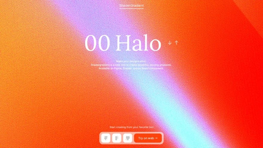
Four drop-in tools cover most of this category: ShaderGradient, Unicorn Studio, 21st.dev and Vanta.js. None of them is a separate technique. Underneath, they are the same canvas, shader and three.js background effects already covered above, so what you are buying is the interface and what you are paying is the runtime that comes with it. For the three.js-based ones, that floor is the three.js row in the table. If you are working in React, ShaderGradient and 21st.dev both ship as React components, and Unicorn Studio exports web components.
Worth reading what they tell you themselves. Vanta.js, the most visible of the four, says plainly that “some WebGL effects are slow on older computers”, that you should not use “more than one or two in a single page”, and that not all its effects work on mobile at all, so you should set a background image or colour as a fallback. That is good documentation, and it applies to the whole category.
ShaderGradient
Shader gradients you configure in a visual editor and drop into React or Figma.
Aimed at designers who want shader effects without writing shader code. You are configuring someone else's effect, so the ceiling is their preset range.
Visit ShaderGradient ↗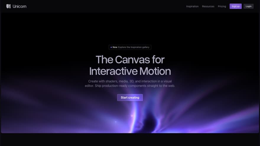
Unicorn Studio
A visual editor for shaders, media, 3D and interaction that exports web components.
The widest scope of the four: shaders, media, 3D and interaction in one editor. That also makes it the one with most to learn before you get something out of it.
Visit Unicorn Studio ↗
21st.dev
A library of crafted React components, including animated heroes and shader backgrounds.
You copy the code in, so you own it afterwards and you only ship what you took. The catalogue is public, so treat anything you copy as a starting point.
Visit 21st.dev ↗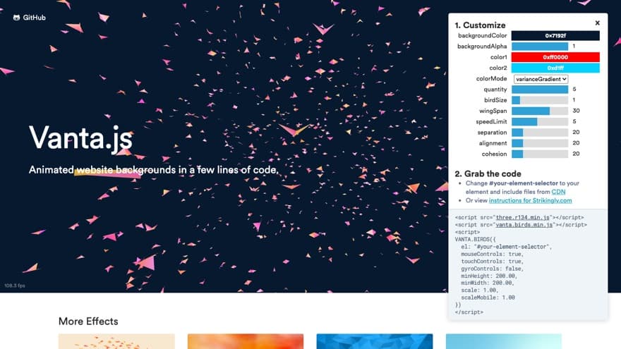
Vanta.js
Drop-in animated 3D backgrounds for a website, built on three.js.
Dominates the search results for animated backgrounds, so it is probably how you met this topic. Its own documentation is upfront that the effects run slowly on older machines and that you should not stack more than one or two per page.
Visit Vanta.js ↗
Video loops: real light, real megabytes
A video loop gives you organic light, refraction, and grain that procedural code can’t fake. It is also the only technique here priced in megabytes, and the only one a phone can simply refuse to play.
That last part is worth designing around now and not debugging later. Phones block autoplay when the battery saver is on. Correctly built, correctly encoded, and it still shows a play button instead. You can’t detect it and you can’t override it. So treat the poster frame as the background a real slice of your visitors will see, and make it look finished on its own.
The technical bit: encoding and autoplay rules
Encoding. A well-compressed 10-second 1080p loop is about 2–6 MB as H.264, or 1–3 MB as AV1. AV1 decodes in hardware on most machines sold since 2022, but not on Apple hardware older than the M3 and iPhone 15 Pro generation, so ship a chain instead of one file: AV1 first, WebM/VP9 second, H.264 last as the one that plays everywhere.
Autoplay. Mobile browsers need autoplay muted loop playsinline on the element. muted is what earns the right to autoplay at all; playsinline is what stops iOS throwing your background into fullscreen.
Battery saver. iOS blocks autoplay outright in Low Power Mode and deliberately doesn’t expose the state, because that would be one more thing to fingerprint people with. Treat playback as something that can fail: call play(), catch the rejection, leave the poster showing.
The loop above is from our Glass Materials pack: 100 clear, refractive Materials, each supplied as a still, a 1080p H.264 loop, and a transparent PNG.
Static-with-motion: a strong still that barely moves
Static-with-motion is one still image and about six lines of CSS, moving so slowly you never catch it moving. It is the only technique here that costs nothing to run: no render loop, no GPU work, no library.
The motion is a slow scale and travel: the image starts fractionally larger than its frame and moves a few percent across roughly 48 seconds, out and back, forever. That timescale is the entire trick. At 10 seconds it reads as a slideshow; at 48 it reads as depth, and a visitor who scrolls past in four seconds registers only that the page felt alive. The image is scaled up first so the movement never exposes an edge.
Which creates a problem for the demo above: at a true 48 seconds it moves about a pixel and a half per second, and you would swear it was a photograph. So it runs at 18 here to be visible in the time you will give it. Build yours at 48.
The whole technique, which is short enough to read rather than prompt. Point your coding agent at it if you want it wired into a component, or just paste the CSS.

.hero-still {
  position: absolute;
  inset: 0;
  background: url("/your-still.jpg") center / cover no-repeat;
  animation: drift 48s ease-in-out infinite alternate;
  will-change: transform;
}

@keyframes drift {
  from { transform: scale(1.06) translate3d(-1.6%, -1.1%, 0); }
  to   { transform: scale(1.15) translate3d( 1.6%,  1.1%, 0); }
}

/* Not optional. For some visitors motion is an accessibility need. */
@media (prefers-reduced-motion: reduce) {
  .hero-still {
    animation: none;
    transform: scale(1.06);
  }
}

THE FOUR THINGS THAT MATTER

1. 48 seconds. This is the entire trick. At 10 seconds it reads as a slideshow; at 48 it reads as depth, and a visitor who scrolls past in four seconds registers only that the page felt alive. If you change one number, do not change this one first.

   (The demo on this page runs at 18 seconds, not 48, and deliberately. At the real production speed it travels about a pixel and a half per second, which is correct on a page someone reads for minutes and useless in a box someone looks at for five seconds. Build yours at 48.)

2. Scale above 1 at both ends. At scale 1.06 there is 3% of overflow on each side and the translate travels 1.6%, so the edge never comes into frame. Start from 1.0 and you will get a hairline of background sliding in at the corners.

3. `alternate`, not a loop back to the start. It eases out and back, so there is no seam. A plain `infinite` loop snaps home every 48 seconds and the snap is the one thing a viewer will notice.

4. `will-change: transform` so the browser promotes the layer once, rather than repainting the image on every frame.

WORTH ADDING

A vignette over the top if your still was composed at a different aspect ratio to the box you are dropping it into, a radial gradient from transparent at 40% to about 55% black at the edges keeps the subject in the frame rather than running off it. And a light grain layer at around 5% opacity if the image has large smooth gradients in it, for the same reason every other effect on this page has grain: eight-bit displays cannot render a smooth ramp between two close colours without banding.

WHAT NOT TO DO

Do not add a parallax-on-scroll to this as well. The whole argument for the technique is that it costs nothing and never fights the content; a scroll handler gives back both of those. If you want the background to respond to the reader, you have chosen the wrong technique from this article.
Use it when you already have an image strong enough to carry a hero, or when the page has to hold its frame rate on hardware you can’t predict. Skip it if you don’t have that image. This technique has nowhere to hide: there is no effect layered over the picture to carry it, so whatever the picture is, that is what the page is.
Everything above this section gets its character from code. This one gets it from the picture, so the picture carries the whole hero on its own. That is the appeal: the right image needs no effect over it, and it will hold someone’s eye for as long as they stay on the page. If you don’t have that image, Materials¹ is 160 stills, built for exactly this.
Which animated background should you use?
Match the technique to the page, not to an effect you liked somewhere else. CSS suits a content-heavy page, a WebGL shader suits a hero section carrying one message, canvas suits effects made of countable parts, three.js suits a background that has to feel like an object, video suits photographic light, and a still with slow motion suits a page that already has a picture worth looking at.
- CSS if the page is content-heavy and the background’s job is atmosphere. It works everywhere and costs almost nothing.
- A WebGL shader if the hero section carries one message and can afford a centrepiece. This is the default for a statement.
- Canvas if the effect is made of countable things, or if you want code you can open and change yourself.
- Three.js if the background should be an object and not a field. It is the only route to real geometry that answers the cursor, and by far the heaviest.
- Video if you need photographic light. One per site, in the hero, and design the poster frame as though the video never plays.
- A still with slow motion if you already have a picture worth looking at. Nothing here is cheaper or more reliable.
- A drop-in tool for any of the above when the deadline is the constraint. The question to ask is whether the effect you want sits inside the range the tool exposes, because that range is your ceiling.
Three things apply whichever you pick: it must hold its frame rate on a phone, it must stop moving for anyone who has asked their computer to stop moving things, and anything built from soft gradients needs a little grain or it will band on ordinary screens.
Worth saying plainly: the build is no longer the hard part. Any of these six is a prompt and an afternoon away, which is exactly why the choice matters more than it used to. Most pages comparing them will show you the effect and leave you to work out whether it suits you. Start from your page and pick backwards.
The technical bit: the three rules, in full
Cap the pixel ratio on canvas and WebGL effects. Phones ship at 3 or higher, and uncapped you are rendering pixels nobody can see. Two is the usual ceiling; better still, measure. The event horizon demo starts at 2 and drops itself if the first second of real frames can’t hold rate.
Respect prefers-reduced-motion by rendering a single static frame, not a slower animation. Some visitors need motion to stop, and a slower animation is still motion. Pause the render loop on hidden tabs while you are there; it is the same handful of lines.
Add grain to anything built from blurred gradients. Eight-bit displays cannot render a smooth ramp between two close colours, so you get visible steps; noise breaks them up. Mix it into the effect. Laying an overlay on top does not work as well.
The four settings that make it yours
Every animated background ships with defaults, and the same four settings separate one you installed from one that belongs to your page: the palette, the timescale, the grain and the intensity.
- The palette. Swap the colours for yours. In a shader this is a handful of constants; in a video it is a grade. It is the cheapest change and the one that does the most.
- The timescale. Demos are tuned to sell an effect in seconds. Your page has a visitor for minutes. Slow it down until you stop noticing it, then slow it a little more.
- The grain. Anything built from blurred gradients will band on an 8-bit display. A little noise, rendered inside the effect, removes it.
- The intensity. Almost every default is set louder than a real page wants, because a demo has to be legible in a thumbnail. Turn it down until it reads as atmosphere and not as a feature.
None of this takes a studio budget or a week. It is four numbers.
Frequently asked questions
How do I add a shader background to my website?
You need three things: a canvas element, a fragment shader, and a small render loop, with no libraries required. The fastest route is to paste one of the prompts from this page into Claude Code or Cursor and let it generate the whole setup, then tune the colours to your palette. If you'd rather start from working code, the mesh gradient demo above is a complete reference implementation you can copy and adapt. Either way, make sure the result renders a static frame when the visitor has reduced motion enabled and pauses when the tab is hidden.
Do I need three.js for an animated background?
Usually not, and it's worth knowing when you do. For full-viewport effects such as colour meshes, glows and drawn light objects like the first three demos on this page, a raw WebGL fragment shader does everything three.js would, in under 10 KB with zero dependencies. Three.js earns its weight when you want a genuine 3D scene: real geometry, lighting, camera movement, or objects that respond to scroll and cursor. If that's your goal, use it without hesitation; it's the standard, your coding agent knows it inside out, and fighting raw WebGL for scene work is effort with no payoff.
How do I recreate an animated background I saw on another site?
Start by working out the technique, because that's 80% of the job. Open the site's DevTools and inspect the hero: a canvas element means WebGL, plain divs with blur and gradients mean CSS, and a video element answers the question by itself. Once you know the technique, describe it specifically to your coding agent. "A full-viewport WebGL shader blending five colours with slow noise-driven movement" will get you close, where "make it look like that site" won't. The prompts on this page cover the most common cases.
What should I put in my website's background?
One idea, executed properly and tuned to your palette. A background's job is atmosphere. The moment it competes with your headline it's working against you. If your page is content-heavy, pick something quiet like soft dark glows. If your hero makes a single bold claim, you can afford a centrepiece. And if you're unsure, a beautiful still image with one slow movement is the option that almost never looks wrong.
Are animated backgrounds bad for performance?
Only the heavy ones, and the weight lives in predictable places. A CSS glow effect is a few kilobytes and animates properties the browser composites cheaply. A single-pass WebGL shader is under 10 KB of code but does cost GPU time, so cap the pixel ratio at 2 and pause it when the tab is hidden. A three.js scene adds a heavy library but runs a trivial render for simple objects. Video is where budgets blow up into megabytes, and drop-in effect libraries often add 100 KB or more before you've configured anything. The one universal rule: respect prefers-reduced-motion. Some visitors need motion to stop, and a slower animation is still motion.
Should I use video or code for my animated background?
Use video when you need organic texture such as real light, refraction and film grain, because code can't convincingly fake those. Use code when you need something weightless, adaptive, or interactive: a shader recolours with one variable and costs kilobytes, while a video is fixed footage and costs megabytes. A useful middle path is a rendered loop or still from an asset pack, which gives you the organic quality without running a 3D pipeline of your own. Whichever you choose, dark backgrounds are forgiving: compression artefacts and banding both hide in shadow.
I'm about to animate my hero. Any suggestions?
Start from your constraint, not from an effect you've seen. If the page is content-heavy, go quiet: dark glows, slow movement, nothing that competes with reading. If the hero makes one big claim, you've earned a centrepiece: a mesh or a drawn light object behind the headline. If your brand needs warmth and texture, use a video loop or a strong still with a single slow move. If the background should feel like a physical object, that's where three.js earns its place. Then take the matching prompt from this page, swap the palette for yours, and strip anything that looks like a template default. That last step is the one that makes it yours.